Charles Wright Number Plate Font
A Wilson
5/7/20253 min read
The Unsung Hero of the Road: The Charles Wright Font on Your Number Plate
We see them every day, multiple times a day. They're on the car in front of you at the traffic lights, the one overtaking you on the motorway, and the one parked down your street. They are, of course, vehicle registration plates. And while you might focus on the letters and numbers themselves, have you ever stopped to consider the font they're printed in? That distinctive, no-nonsense typeface is called Charles Wright.
It's a font that's become so ingrained in the visual landscape of British roads that it's almost invisible. Yet, it plays a crucial role in identification and road safety. So, who was Charles Wright, and why is this particular font so significant?
A Legacy Forged in Metal
Interestingly, the "Charles Wright" in question isn't necessarily a specific individual designer, but rather the name of the metal stamping company, Charles Wright & Son, based in London. Founded in the 19th century, the company initially produced items like medals. By the 1930s, they had moved into manufacturing vehicle registration plates.
It's believed that in 1935, Charles Wright & Son developed the original, wider sans-serif typeface specifically for stamping onto these metal plates. This robust and clear design was chosen for its legibility, a paramount concern for quick and accurate vehicle identification.
The Evolution to Charles Wright 2001
For decades, the original Charles Wright font served its purpose admirably. However, as vehicle registration formats evolved, a change was needed. In 2001, a slightly condensed version of the font, often referred to as Charles Wright 2001, became mandatory for all new vehicle registration plates in the UK.
This adaptation was crucial for accommodating the new number plate system, which included space for an extra character and the optional European Union flag or GB identifier. The condensed design allowed for this without compromising the crucial legibility of the characters.
Why Charles Wright? The Characteristics of Clarity
The Charles Wright font isn't flashy or ornate. Its beauty lies in its functionality. Key characteristics contribute to its effectiveness on number plates:
Sans-serif design: The absence of decorative strokes (serifs) makes the letters and numbers clean and easy to read at a glance, even at speed or in varying weather conditions.
Uniform stroke weight: The consistent thickness of the lines forming each character enhances visibility and reduces ambiguity.
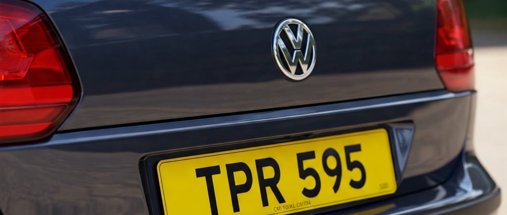
Distinct letterforms: Each letter and number is designed to be easily distinguishable from others, minimizing the risk of misreading a registration. Notice the distinct angled strokes in the 'M' and 'W', and the clear, open shapes of other characters.
Standardized dimensions: Beyond the font itself, strict regulations govern the height, width, and spacing of the characters on a number plate, all contributing to overall legibility.
More Than Just a Font: A Matter of Law
The use of the Charles Wright 2001 font isn't just a recommendation; it's a legal requirement. Any number plates not adhering to this prescribed font are considered illegal and could lead to MOT failures and potential fines. This strict adherence ensures consistency and makes it easier for law enforcement and Automatic Number Plate Recognition (ANPR) systems to accurately identify vehicles.
The Modern Legacy
While the original Charles Wright & Son company may no longer be around, their typographic legacy lives on in every vehicle on UK roads. The Charles Wright font, in its evolved 2001 form, remains an unsung hero of road safety and vehicle identification. It's a testament to the power of good design – a functional and clear typeface that quietly and effectively does its job, day in and day out.
So, the next time you glance at a number plate, take a moment to appreciate the simple yet crucial design of the Charles Wright font. It's a small detail that plays a big part in keeping our roads safe and organised.
Registrations
Premium personal car registrations for discerning customers.
CONTACT
sales@perfectnumberplates.uk
© 2025 Perfect Number Plates
REGISTERED ADDRESS
18, Alderson Drive, Burton on Trent. DE13 0QQ
Check out our other websites which include Midlands HGV Medicals, Derby HGV Medicals & HGV Medical Near Me & HGV Medical Derby